A Moment That Changed The Way I Design
The first time I opened Ideogram, I honestly expected another average AI art tool. I had already tested Midjourney, Canva’s AI, and a dozen image models. Nothing surprised me anymore.
But one afternoon, while helping a friend design a poster for her fitness studio, I typed a simple prompt in Ideogram. The result loaded in a few seconds. She stared at the screen for a moment, then laughed and asked, “Hold on, how did it make the text look this perfect?”
That moment made me stop. Because clean typography in AI images has always been a headache.
That was the day I realized something important:
Ideogram is not just another AI image tool. It is one of the very few tools that truly understands text inside images.
This article is not a typical tutorial. I am going to share how I personally use Ideogram for real projects, what works, what fails, design strategies, mistakes beginners make, and scenarios you can copy to create better visuals immediately.
And of course, we will naturally explore how to use ideogram in a practical, beginner friendly way without overwhelming jargon.
Why Ideogram Became My Favorite AI Design Tool
Before we dive into tutorials and techniques, here are the real reasons Ideogram stands out after weeks of using it daily.
1. It handles typography better than any other AI tool
If you’ve ever tried writing text inside Midjourney or Stable Diffusion, you already know the pain: letters get distorted, spacing looks random, and sometimes the words are not even readable.
Ideogram changes that game.
2. You can generate ready to use designs without extra editing
I have used Ideogram to create:
- YouTube thumbnail elements
- Social media quote graphics
- Website banners
- Product mockups
- Posters
Most results need zero extra Photoshop work.
If you design visuals for blogs or websites, my breakdown of the Best CMS Platforms will help you understand which platforms handle media and graphics most efficiently.
3. Beginner friendly interface
Even a total beginner can create polished designs within minutes. This is rare in the AI world.
4. Reliable consistency
If I ask for modern aesthetic posters, Ideogram keeps the vibe consistent across multiple variations. Midjourney sometimes struggles with this.
5. It is fast
I have seen results appear in two to five seconds, even during high traffic hours.
But the real power comes from how you use it, not just what it offers.
Let me walk you through the actual workflow I use every week.
How to Use Ideogram: My Real Workflow From Idea to Final Image
Step 1: Start With An Intention, Not A Prompt
Most beginners jump directly into typing complicated prompts. In reality, the design quality depends on how clear your intention is.
Before I prompt anything, I ask myself:
- What emotion should the design trigger
- Who will view this design
- Is the design meant for inspiration or marketing
- Do I need clean text or only visuals
- What style will make it eye catching
If you want to improve how you think before prompting, my guide on How to Use Perplexity for Research can help you refine ideas much faster.
Let me show you a real example from a recent client project.
Mini Case Study: Creating a Travel Poster
The client wanted a warm, dreamy poster about solo traveling through Turkey. Instead of starting with an elaborate prompt, I wrote down my intention:
- Warm color palette
- Vintage yet modern
- Highlight the emotion of freedom
- Readable title text
Only after defining these, I moved to Ideogram.
Step 2: Write The First Prompt Like You Are Talking To A Designer
One thing I have learned: simple prompts get the best results in Ideogram.
Here is the exact first prompt I used:
A dreamy travel poster of a person exploring Cappadocia, warm lighting, soft orange tones, minimal modern layout, bold clean title text that says "Explore The Unknown", cinematic photography style, inspiring mood
Result:
Three out of four images were usable immediately.
This is where Ideogram feels magical.
Step 3: Use Styles As Your Creative Multiplier
Ideogram has style presets that beginners often ignore. In my experience, they multiply the output quality.
The presets I use the most:
- Cinematic
- Typography
- Minimalistic
- Digital Illustration
- Vibrant Poster
When I want commercial quality designs fast, I choose “Typography” for clean text or “Minimalistic” when I want a premium look.
Step 4: Iterate Until You Get The “Perfect” Look
Here is something most tutorials never tell you:
Ideogram responds extremely well to micro adjustments.
For example, if the image looks great but the text is slightly off, I write:
Same image, same style, fix text spacing, make text more modern, keep layout balanced
If I want a more luxury feel, I add:
elegant premium style, thin gold accents, balanced composition
These small refinements can instantly make your design look like it was made in Adobe Illustrator.
Step 5: Upscale and Export
Clicking the Upscale option gives a clearer, print ready image. The exported files work perfectly in tools like Adobe Express or Canva for final touch-ups.
I often polish my AI visuals using tools I also explained in Best AI Photo Editors With Prompt Features because they help add the final professional shine.
What Beginners Usually Get Wrong (And How To Avoid It)
Over the last few months, I have reviewed dozens of beginner AI designs. The mistakes are always the same.
Mistake 1: Overprompting
Beginners write paragraphs with 45 instructions.
Ideogram responds better to fewer words and clearer direction.
Mistake 2: Asking For Too Many Design Elements
For example, asking for:
“Vintage futuristic colorful minimal detailed poster with gradients, anime detail, neon light and handwritten text”
This confuses the model.
Mistake 3: Creating Designs Without Thinking About Human Attention
What makes a design eye catching is not complexity. It is:
- Contrast
- Simplicity
- Clear center of attention
- Readable typography
- Balanced space
Ideogram helps, but the thinking must come from you.
Real Prompt Examples You Can Copy Today
Below are tested prompts from my own projects.
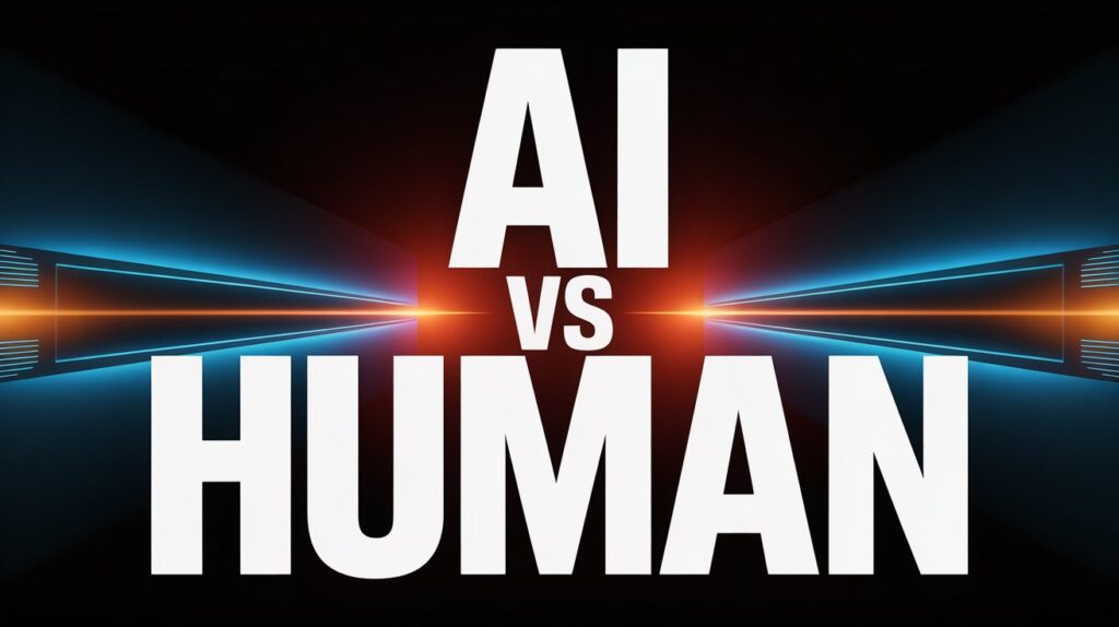
1. High Impact YouTube Thumbnail Style
A bold high contrast design with large readable text "AI VS HUMAN", cinematic lighting, dark background with glowing accents, clean modern layout, professional YouTube thumbnail style
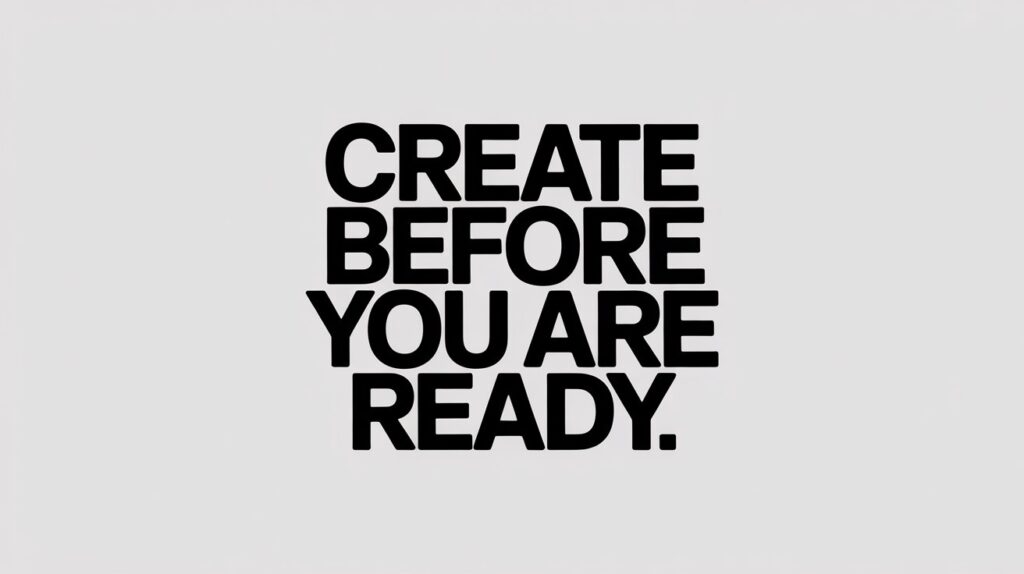
2. Motivational Quote Image
Minimal black and white quote design, bold modern font, centered text that says "Create Before You Are Ready", aesthetic clean layout, subtle shadow, premium feel
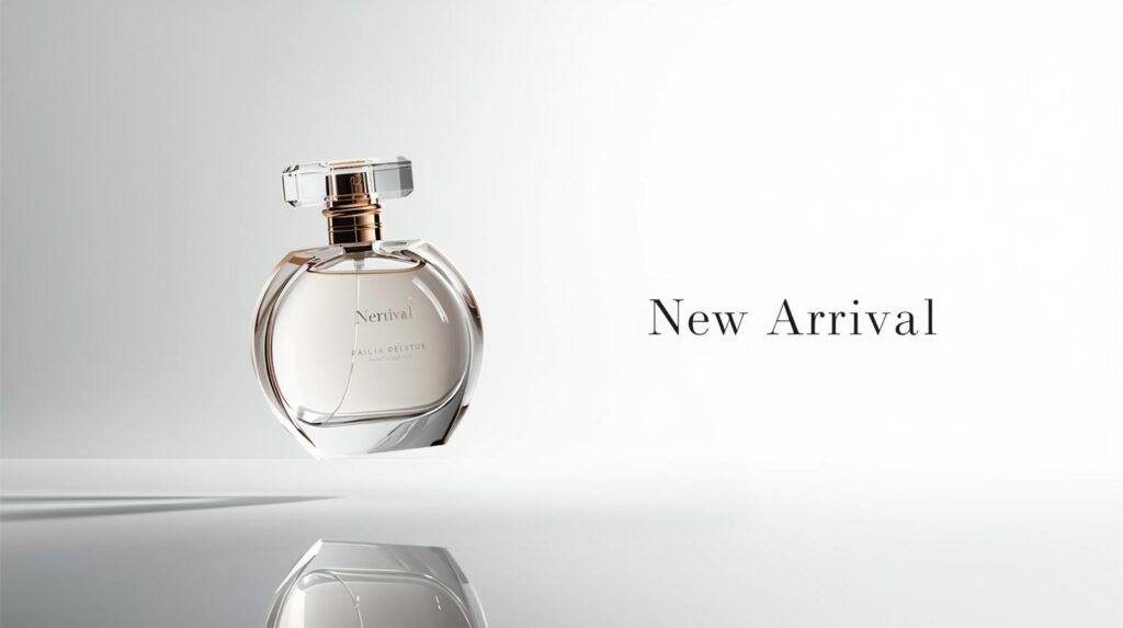
3. Ecommerce Product Ad
Luxury perfume bottle floating in soft spotlight, reflective surface, clean aesthetic background, elegant thin text that says "New Arrival", professional product photography feel
All three generate eye catching outputs consistently.
When I compared my early Ideogram drafts with traditional design rules, I noticed how much the tool naturally follows established visual hierarchy principles. The same ideas are highlighted in this Nielsen Norman Group research on visual design, which explains why contrast and balance instantly shape user attention.
A Comparison: Ideogram VS Midjourney For Beginners
| Feature | Ideogram | Midjourney |
|---|---|---|
| Text inside images | Almost perfect | Often distorted |
| Beginner friendly | Very easy | Requires practice |
| Consistency | High | Medium |
| Speed | Fast | Medium |
| Best for | Posters, quotes, ads, thumbnails | Artistic freeform visuals |
One thing I learned while testing Ideogram is how unusually accurate its typography looks. It aligns closely with classic type principles explained in Adobe’s official typography guide, especially the parts about spacing and letter clarity.
When Ideogram Is Not The Best Choice
As much as I love Ideogram, it has limitations.
1. Complex fantasy art
Midjourney does better with surreal worlds.
2. Detailed character consistency
You cannot keep the same character across multiple scenes easily.
3. Very niche artistic styles
Sometimes it interprets creative styles too literally.
Knowing these limitations helps you pick the right tool for each job.
My Advanced Framework For Creating Eye Catching Ideogram Designs
I built this framework after experimenting with more than 300 prompts.
Step 1: Define the emotion
Hope
Energy
Fear
Calmness
Luxury
Every design is emotional before it becomes visual.
Step 2: Choose the style
Minimal
Bold
Aesthetic
Cinematic
Illustrative
Corporate
Step 3: Select the focal point
Is it the person
Is it the product
Is it the typography
Step 4: Add a contrast strategy
High color contrast
Large text vs small background
Bright object on muted canvas
Step 5: Use micro adjustments to refine
Adjust lighting, color tone, spacing, angles.
This framework makes 80 percent of my designs look professional without extra tools.
Conclusion: Why Ideogram Should Be Your Starting Point
If you are a beginner or even an intermediate designer, learning how to use ideogram can significantly speed up your creative workflow. In my experience, no other AI tool delivers such clean typography, balanced layouts, and reliable commercial quality with so little effort. It removes the technical barriers so your creativity can breathe.
The interesting part is how quickly your results improve once you start experimenting. The more you play with emotion, style, contrast, and short prompts, the more refined and eye catching your designs become. Ideogram gives you the tools, but your perspective is what gives every design its personality.
If you want more tools to experiment with alongside Ideogram, I’ve listed several options in my guide on Free AI Image Generator Tools which are great for expanding your creative range.
FAQs About Using Ideogram for Eye Catching AI Designs
What is Ideogram and why do designers love it?
Ideogram is an AI image generator known for creating clean, readable typography inside images. After testing dozens of AI tools, I found Ideogram to be the easiest for beginners who want ready to use posters, ads, and social graphics without extra editing.
How do I write a good prompt in Ideogram?
Keep your prompt short and clear. Tell Ideogram the mood, style, and main subject. The tool performs best when the prompt feels like you are giving quick direction to a designer, not writing an essay.
What types of designs work best in Ideogram?
From my tests, Ideogram is perfect for posters, YouTube thumbnails, quote graphics, product ads, minimalistic designs, and commercial visuals that require readable text.
Does Ideogram replace tools like Canva or Midjourney?
Not completely. Ideogram is faster and cleaner for text based visuals, while Midjourney is better for artistic or fantasy visuals. Canva remains handy for final polishing. I often use all three depending on the project.
Why are my prompts not giving the results I expected?
Overprompting is usually the issue. Beginners tend to cram too many elements into a single prompt. Try simplifying the idea. In my experience, fewer words often produce better designs.
Can I use Ideogram designs for commercial projects?
Yes. I have used Ideogram visuals for client ads, social posts, and digital banners. Just verify the licensing rules on the official site, but generally the output is safe for commercial use.
Does Ideogram struggle with anything?
It is not the best for highly detailed fantasy scenes or character consistency across multiple images. For those tasks, Midjourney performs better.
How fast is Ideogram compared to other AI tools?
Very fast. Most of my images load in two to five seconds, which makes it perfect for bulk creation or last minute design tasks.